7 Ways you can improve your website
Why spend time on improving your website? Quite simply, the better your website is the more likely it is that someone will make an enquiry and the more your business will grow.
Free Website Template
We know that some people have sites which are old and require a lot of updates or are using systems where it's difficult to update the content. If you are one of these we have created a website design which you can use for free. It follows all the best practices outlined below, to see what the website looks look click here.
If you would like to us this as a template please email us at info@autobead.com.
7 simple ways you can improve your website today.
If you would like to keep your current website below are 7 ways you may be able improve it
1. Make it easy to understand what your business does.
You have less than 5 seconds to engage a visitor before they leave. Because of this you have to make the information on the website as clear as possible. People don’t read long paragraphs of text so use Clear headings and images where appropriate.
Bad Practice Example
Even though the Mr. Sponge website below has ‘Mobile Car Detail Valeting Service London’ in the header it’s very small and could easily be overlooked. The main header is taken by ‘NANO TECHNOLOGY PROTECT CARS’ which may lead website visitors to believe that the website is selling a product rather than provide valeting services.
![]()
Good Practice Example
Silver Mobile Car Valeting has a clear heading stating what they do with ‘Welcome to Silver Mobile Car and Commercial Valeting Services’. This could be improved by stating what geographical areas they service.
![]()
2. Place important information in the ‘Priority Areas’.
A website visitors eyes flows from the top left down and then to the right. Due to this the content should be prioritised according to this.
Below is a simple eye tracking page planner which shows what each of the areas should be used for:

Red:
- Company branding
- Promote USP
Yellow:
- Important messages
- Funnels
- Current offers
Green:
- Company text
- Secondary calls to action
Bad Practice Example
Smart Car Wash has placed their Facebook like call to action in the most important area of the page. If their objective is to get Facebook likes this is a good idea, but if they are looking to generate enquiries they would be better off prioritising messaging regarding their services.

Good Practice Example
Fast Car Mobile Valeting has a clear layout where they have prioritised the call to action of ‘Book Now Your Valeting Service’

3. Make the navigation clear.
A clear navigation allows the website visitor to find the information they are looking for. If the navigation isn't clear the visitor won't know where to click and will most likely leave the site.
Key aspects to consider:
- Don't have more than 7 items. More than that will make it look cluttered and the short term memory can only memorise 7 items.
- The navigation items should be labeled so that if that was the only information the visitor had access to they would have an understanding of what the site is about.
- Make sure you speak the customer's 'language' so that they understand what the label means.
- When you decide on the order of the items put the items that are most important to your customer first, not the items which are most important to you.
Bad Practice Example
The Auto-Gleam navigation could be improved by changing the 'Services' item to the actual services they provide. It would also be worth considering moving the 'News' item further to the right as it is likely that most visitors will be more interested in finding out more about their services.

Good Practice Example
The Navigation below makes it very clear what services they provide and allows visitors to find out more information about that service within 1 click.
4. Use segments & funnels
Just having a navigation relies on your site visitors to find the information they need. Using funnels allows a web page to:
- Guide visitors to information they are looking for
- Target multiple segment needs
The key principle to follow is:
Every page should have what the visitor is looking for
or
a clear link to get them there
Bad Practice Example
The ‘City Car Valeting website relies on website visitors to use the main navigation to find out more about the services they provide.

Good Practice Example
The homepage below from 'AUTOSHINE' shows how it uses funnels to guide visitors to the relevant page based on the type of service they were looking for (Exterior Valet, Interior Valet or Full Valet).

5. Provide the content that the visitor wants.
The difference between a good and bad website is the same as the difference between a store with good and bad sales person.
A good website or sales person understands:
- When to provide you with certain information
- What information you need
- How to provide the information in the best format
- Different customers need to be treated in different ways
When writing copy for each page on the website take the above points into consideration.
For someone looking for valeting services they are likely to want to know all of the information below:
- What services do you provide? Valeting? Detailing? Interiors?
- What areas do you cover?
- Do you offer mobile services?
- How long will it take?
- What are your prices?
- Are you part of any associations? PVD approved?
- Are you insured?
- Customer reviews
The faster you answer all the questions a visitor may have the more likely it is that they’ll make an enquiry.
6. Use Calls to action
A call to action is like your website closing a sale
- If you want a customer to take an action, then you must explicitly tell them to take that action. Otherwise you are leaving it to chance.
- Numerous sales are lost every day because a sales person simply does not ask the customer for the sale.
- Calls to action are hyperlinks that move your customers through your sales process.
- These links are critical for you – they are the ones you want your customers to click on.
Bad Practice Example
Regal Vehicle Services don’t have any form of call to action on their home page. For a visitor to make an enquiry they are relying on them clicking on ‘Contact’ in the navigation.

Good practice Example
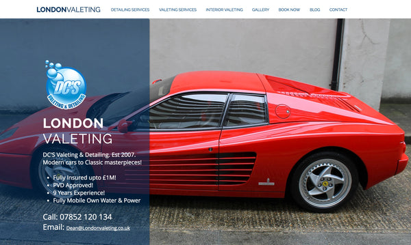
FastKlean have put complete focus on outlining what service they provide and made their phone number easy to find for those wanting to make an enquiry.

7. Measure Your Performance
If you don’t measure you can’t improve
Measuring the performance of your website is fundamental to being able to succeed. You need to know what is working so that you can do more of it, and know what isn't working so that you can either adjust the strategy or stop doing it. It is no longer the big outperforming the small, It’s about the fast outperforming the slow
The formula for success is
Fail Fast to Improve Fast
To measure the performance of the website make sure that you have analytics installed and your goal tracking setup. To find out more about this visit this article on setting up your google analytics.